
AffiniTeam
Collaborative Online UX Application

Affinity diagram is one of the most powerful tools in the UX research phase. However, constructing an affinity diagram can be really exhausting. It usually takes a group of people several days, and thus causes potential coordination problems.
AffiniTeam is a lightweight solution. Gathered user's unmet needs, and developed with d3js, raphaeljs, togetherjs, nlp-compromise and HTML5, AffiniTeam enables you to create diagrams with your teammates on a canvas by one click.
My Role:
UX Designer/Front-End Developer
Scope:
From UX research to web development
CMU Software Structures for User Interface Project
Project is live on https://guozj94.github.io/AffiniTeam/
User Research
In my UX career, I empathized the feeling of using some really powerful but exhausting tools. Early-phase UX tools such as affinity diagram provide valuable and diverse insights and ideas for the large-scale design, however, UX specialists, instead, tend to choose rapid tools to shorten this process nowadays. Although they accelerate the design process, the tradeoff is obvious: they may not provide as much visions as affinity diagram.
Is the affinity diagram to be done this way? Not really. To define the users' frustrations in order to design better UX tools, I interviewed several master and PhD candidates that were all experienced in using complex UX tools. The interview protocol covered the following questions:
- When was the last time you finish an affinity diagram? Please walk me through your experience of constructing the diagram.
- Prompt: How many notes did your team collect?
- Prompt: How long did it take you to finish the walking-the-wall process?
- Prompt: How was the team organized?
- How did affinity diagram help your design in the latter phases?
- How did you feel after finishing it?
- Prompt: Were there any frustrations?
The results showed that for large-scale projects, affinity diagram is still the first choice because it covers all the possible aspects of this domain. However, some common complaints were:
- Tedious preparation work
- Time-consuming to interpret all the notes (people tend to forget)
- Tiring to walk the wall
- Hard to consider the big picture on board since people cannot see all notes easily
- Hard to coordinate the time since this process can be extremely long
Competitive Analysis
There are several online UX tools available. However, as I have observed in the university, few people adopted these tools. To learn from those tools, as well as to study the unmet needs, I performed competitive analysis. The most common problem is, most web applications are not human-centered design. They strongly emphasize on diagraming, nevertheless, they do not facilitate generating insights and ideas.

Gliffy: Gliffy is a powerful diagraming tool with several template. However, Gliffy is not a specific UX diagram tool, nor seamlessly support collaboration.

RealtimeBoard: RealtimeBoard has many UX diagram templates, but it does not take advantage of the technology, rather it mimics the experience in the physical world.

LucidChart: LucidChart is an engineer-based diagraming tool. It has various templates, but the application only has a few functions in terms of UX. And it does not support insight generating.

Drawio: Drawio enables users to create many shapes and establish relationships with XML template. It is not specifically designed for UX purposes, and it can be used collaboratively only on google drive.
Ideation & Prototyping
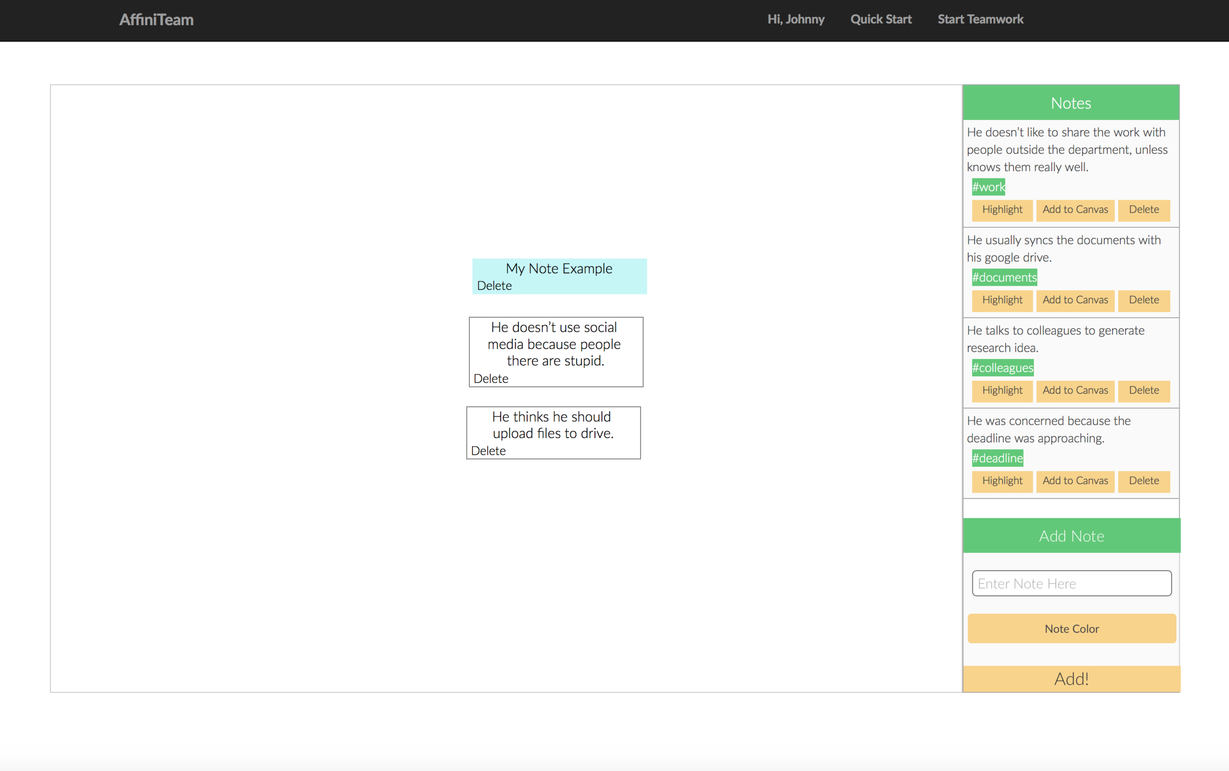
Based on the research findings, I decided to fix these pain points while streamline the research experience smoothly. With the AffiniTeam user should be able to:
- Upload and organize note collaboratively
- Work on a scalable, infinite size canvas
- Quickly grasp the gist of a note
- Create high-level notes
- Generate and record insights and ideas
Therefore, I visioned the product using a paper prototype. I tested the paper prototype with several real users to validate my design

This interactive prototype shows the basic workflow. During the usability test, the user reported several problems:
- Too many control elements on the page
- Can't really recognize each section
- Have to spend many time on dragging
- No prompt indicating what to do
- Hard to quickly understand the notes
According to the problems detected in the first prototype, I redesigned the AffiniTeam.
- Add welcome page to handle uploading
- Add quick start
- Add animation to show visual grouping
- Process the language before showing all notes
- Support undo and redo when deleting a note
- Better visual affordance
To implement the design, I used springs and struts models with CSS3 flex layout. Also, to deal with gulf of evaluation, I applied animation principles solidity and reinforcement.
TogetherJS enabled JSON data transaction between different clients, nlp-compromise processed notes and generated keyword to facilitate reading, and RaphaelJS supported the scalable canvas and vectors on the canvas.

